


Wisen
Healthcare App
CLIENT
Wisen
SERVICES
 Visual Identity
 Brand Strategy
 Web Design
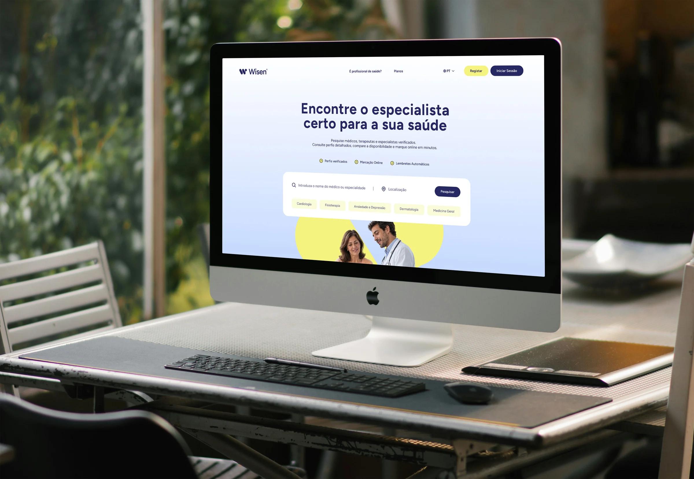
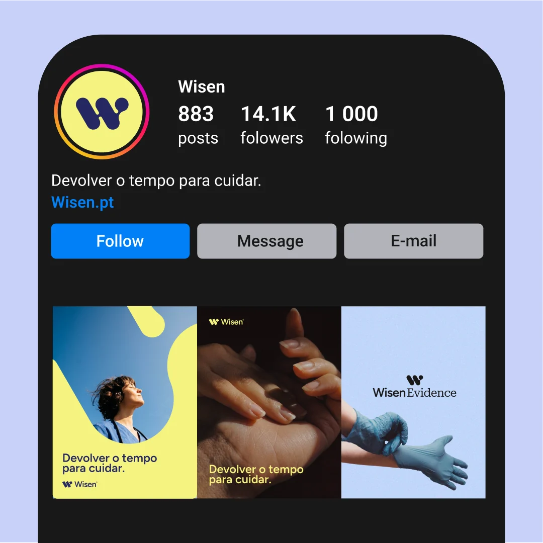
Doctors, nurses and carers across Portugal were losing more and more of their day to paperwork and admin. Wisen was created to change that: a digital health platform built on trust, simplicity and human care that streamlines everyday clinical work. Its promise, “devolver tempo para cuidar,” guided every part of the brand: to give time back to those who care.
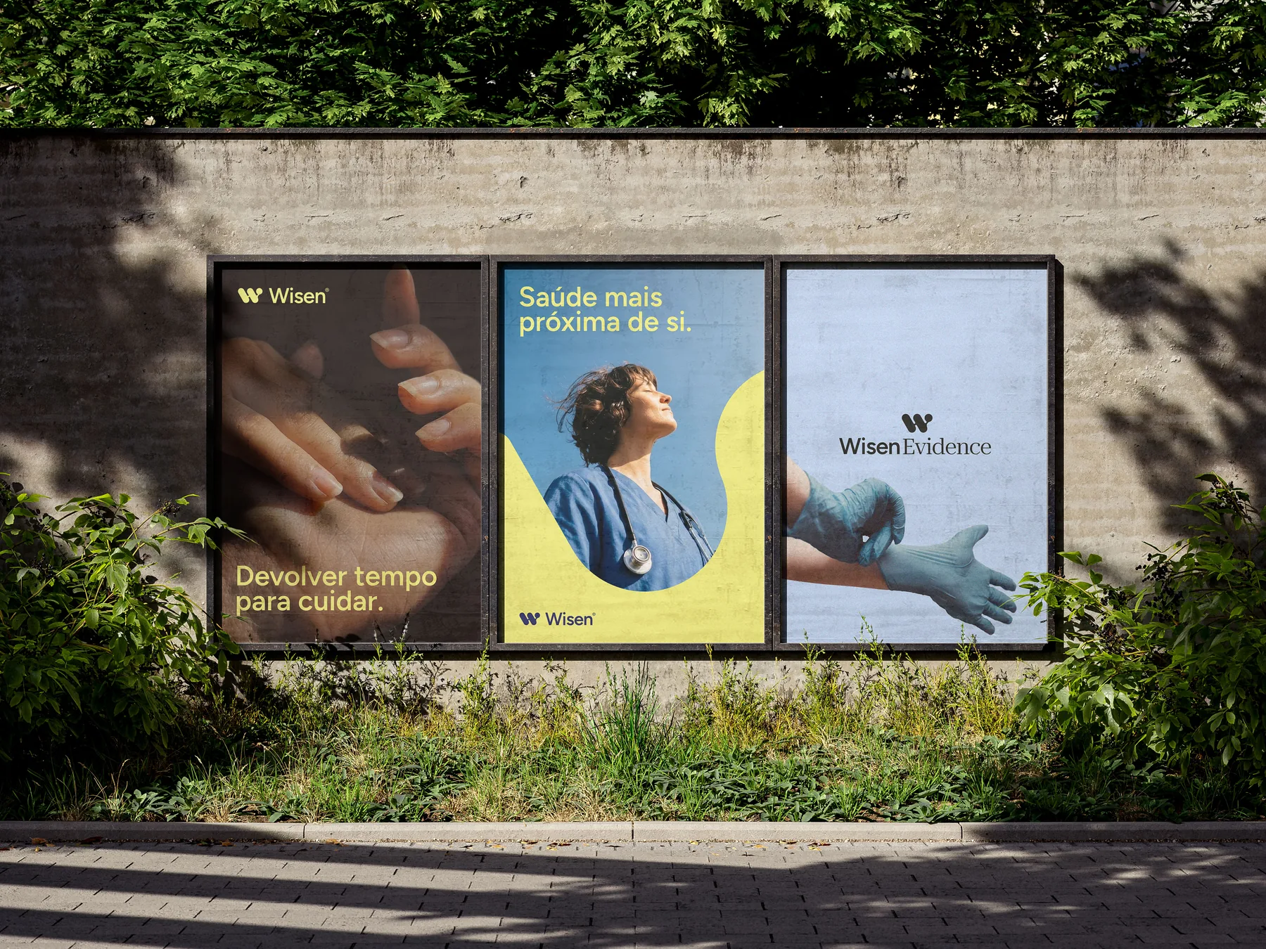
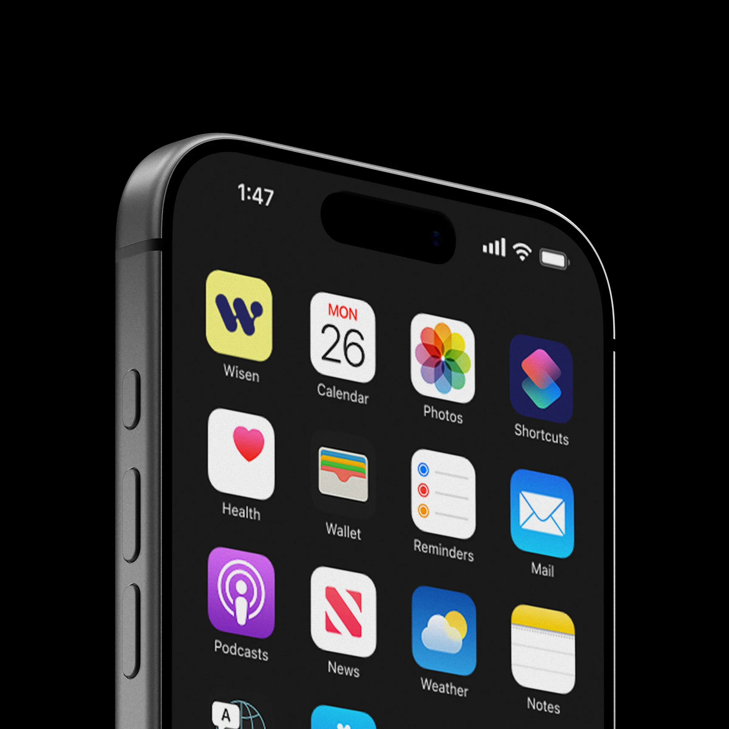
At the heart of the identity is a simple symbol: the “W” and the dot of the “i,” joined in a gesture of giving. Soft, rounded and built on one consistent geometry, it brings warmth to a world of screens and form.